The Essence of Gold Supply and Demand Dynamics
Gold trades more like a currency than a commodity.
Written by Jan Nieuwenhuijs, originally published at Voima Gold Insight.
To understand the price of gold, first, one needs to understand the true nature of its supply and demand dynamics. Because gold is immutable and has been used as money and a store of value for thousands of years, virtually nothing ever mined has been lost. There are vast above-ground stocks of gold, and mine production only adds 1.6% to these stocks annually. Accordingly, gold has a very high stock to flow ratio, and thus trades more like a currency than a commodity. This is the true nature of gold’s supply and demand dynamics. Many consultancy firms, however, present gold’s supply and demand dynamics like that of a perishable commodity, which is misleading and causes deep misconceptions regarding gold’s trading characteristics and price formation.
In this article, we will analyze consultancy firms their gold supply and demand statistics and how this can be misleading to conclude the market is in deficit or surplus (supposedly leading to higher or lower prices). Then we will drill down into more general supply and demand dynamics—comparing gold to other commodities—and finally we will have a look at how gold trades as a currency.
Gold Supply And Demand Balance Data Is Misleading
Every quarter consultancy firms like Refinitiv—or more specific, their GFMS team—publish a supply and demand balance for gold. All supply categories picked by GFMS are matched to all their demand categories, resulting in a surplus or deficit at the bottom of the line. My main objection to these numbers is the “balance approach.”
Below is the most recent balance published by GFMS on gold supply and demand, stretching from 2009 through 2018. The key takeaways are:
Mine production makes up the majority of total supply.
Jewelry demand accounts for more than half of total demand (on average).
The difference between total supply and total demand, is disclosed as a surplus or deficit (or net balance), suggesting the gold price to go down or up.
The balance presented, however, has nothing do to with price direction, because neither the “physical surplus/deficit,” nor the “net balance” line item are correlated to the gold price. And if there’s no correlation, how can there be causation?
Have a look at the next charts, that display the correlation between the annual market balance by GFMS and US dollar gold price. I have inverted the surplus/deficit axis to make it correspond to price direction (as a deficit should increase the price of gold and a surplus decrease the price of gold). Furthermore, I have colored the surplus/deficit bars: a red bar shows a negative correlation, and a green bar shows a positive correlation to the gold price.
We predominantly see red bars in the charts. In the “net balance” chart, 64% of the samples are negatively correlated, in the “physical surplus/deficit” chart, it’s even higher at 86 %. Obviously, the gold “balance approach” by GFMS is misleading.
General Supply and Demand Dynamics
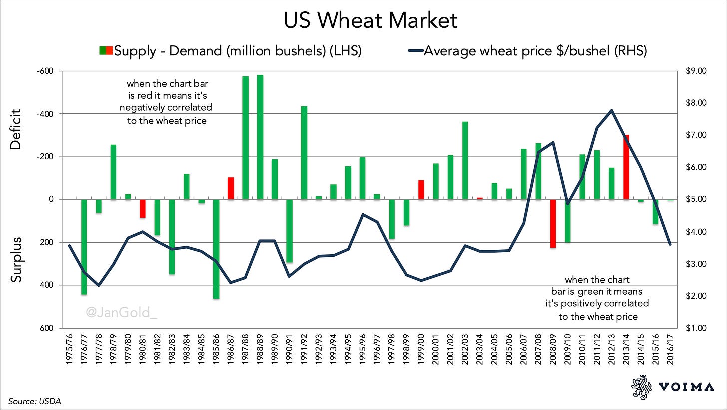
For perishable commodities, it does make sense to conceive a supply and demand balance. Let’s take the wheat and corn markets in the US as examples. From the United States Department of Agriculture (USDA) I have collected supply and demand statistics for both commodities. Supply over one season is what’s produced plus imports. Demand is what’s consumed plus exported. Supply minus demand results in a surplus or deficit. In the chart below, I have plotted the US wheat market balance versus the wheat price.
We can observe that most of the time, when the market was in deficit, the price was up compared to the previous season, and when the market was in surplus, the price declined. The market balance is positively correlated with the price 85% of the time. To avoid cherry-picking (pun intended), in the corn market we see the same predominant positive correlations (78%). This data makes sense and is not misleading. (Kindly note, I’m just scratching the surface here. If one is more interested in corn and wheat supply and demand dynamics, please read Price Determination in Agricultural Commodity Markets: A Primer by Randy Schnepf.)
For corn, the supply and demand “balance approach” makes sense, in contrast to gold, because the former has a very low stock to flow ratio. This ratio is calculated by dividing above-ground stocks (inventory) by annual (mine) production. For gold, it’s very high because gold is indestructible. Let’s go through the math for 2018.
Global above-ground gold stocks: 190,000 tonnes
Annual global gold mine production: 3,300 tonnes
190,000 / 3,300 = 58
The stock to flow ratio for gold = 58
Perishable commodities have a much lower stock to flow ratio, simply because they’re used up. In 2018 the stock to flow ratio of corn was 0.14.
US corn inventory: 53,709 (1000 MT)
Annual US corn production: 366,287 (1000 MT)
53,709 / 366,287 = 0.14
Corn is perishable, which is why annual production is higher than stocks. When consumed, corn is fully used up. Hence, the price of corn is set between the forces of production versus consumption.
Gold cannot be compared to perishable commodities, because gold trading is anything but restricted to what is annually mined. (As noted, above-ground stocks dwarf mine output.) So, gold’s supply-side consist mainly of inventory (a high stock to flow ratio). And, because virtually everyone buys gold as a store of value, and gold is hardly ever used up, the demand side consists mainly of inventory as well. (Jewelry is a store of value combined with aesthetics and status.) As a result, what mainly happens in the gold market is that metal is traded from one inventory to another. The gold price is not set by annual production versus “consumption.”
Across the globe, above-ground stocks are changing hands all year through. This is what makes gold trade like a currency.
Empirically, in the short- and medium-term, gold mine production has little impact on the gold price. From Fergal O’Connor, Lecturer In Finance at Cork University Business School (source):
The [high stock to flow ratio] of gold implies low market power of gold mining firms and thus an inability to significantly influence gold prices. . . . [Mine] production thus follows gold prices.
Gold miners have low market power and are likely to be price takers rather than price setters. . .
Fergal’s quote perfectly rhymes with the essence of gold’s supply and demand dynamics.
Institutional Supply and Demand and the Price of Gold
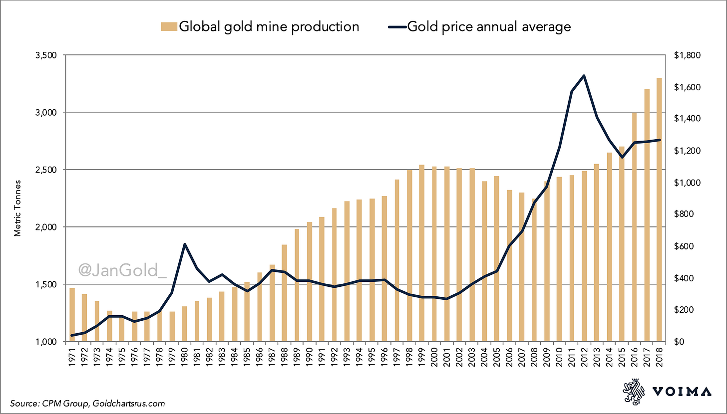
Let us now look closer at what does not drive the price of gold versus what does. As noted earlier, data by GFMS shows that the majority of what they measure as supply is mine production, and the majority of their demand comes from the jewelry sector. In the next chart, I demonstrate that jewelry demand is not positively correlated with the price. Most notable, jewelry demand falls when the price rises and vice versa! It should be said that gold mine production is positively correlated to the gold price, but with a lag of about ten years. This is explained by the fact that when, for example, the gold price rises it takes years for gold mining companies to find new deposits, and additional years to mine the metal once found.
We must conclude jewelry demand does not drive the price of gold, and in short- and medium-term mine production does neither.
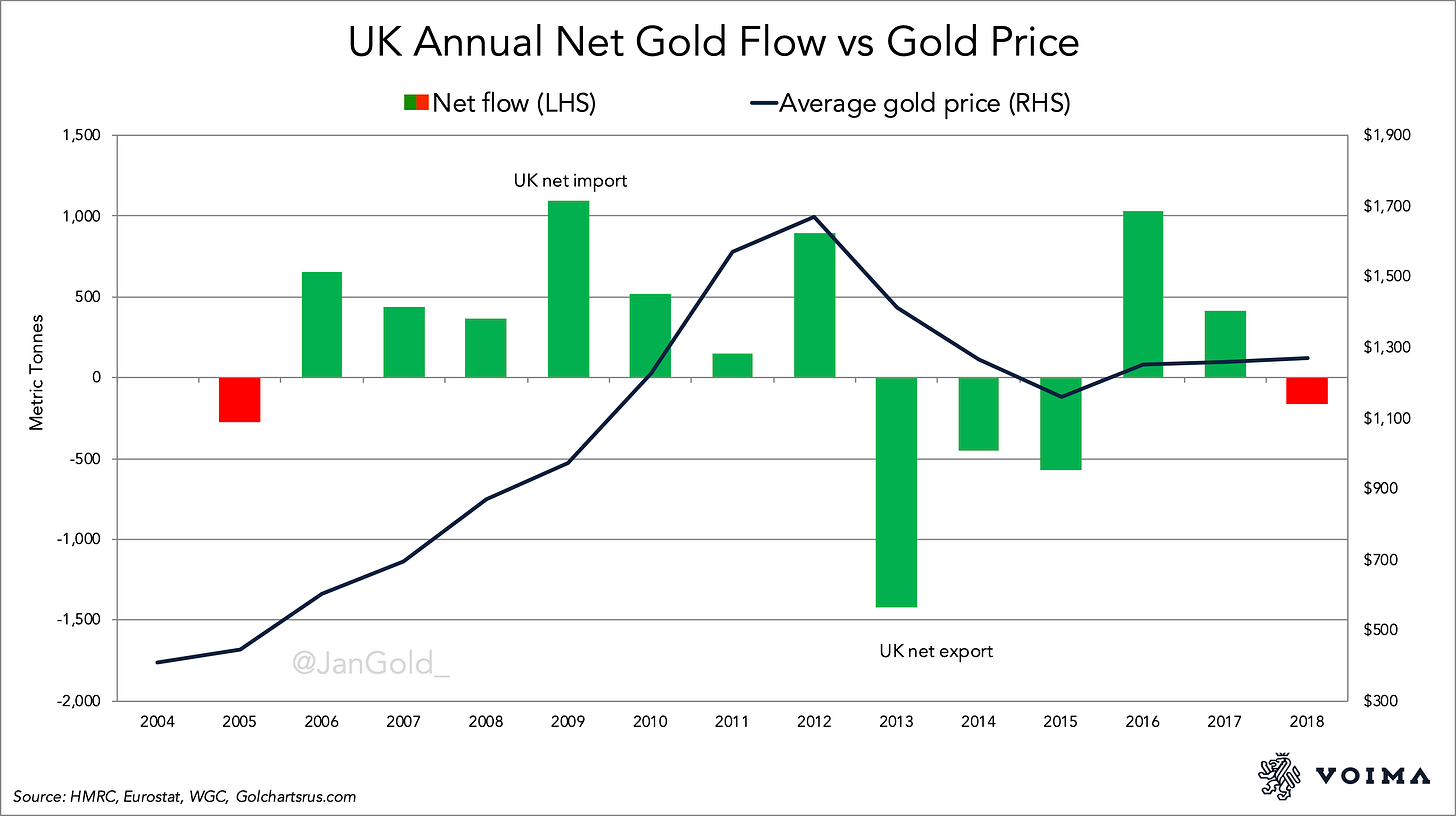
Logically, what does drive the price of gold in the short- and medium-term is supply and demand in above-ground stocks. This is visible in cross-border gold trade in the UK, which houses the heart of the global gold market: the London Bullion Market. The annual net flow through the UK is positively correlated to the gold price 86% of the time.
Gold mining, jewelry demand, and refinery activity in the UK are neglectable. Therefore, the vast majority of UK imports and exports are institutional supply and demand (and ETF flows). And guess what, this category of wholesale bullion bought and sold, is not included in the data by GFMS. From GFMS (emphasis mine):
Gold is also widely used as an investment, however, where physical flows to and from the market can be monitored, to a degree. As such we include the highly visible net-ETF inventory build and also published changes at gold held by futures exchanges. This gives a partial indication of the flow of physical gold from above ground stocks and our net balance for the market. It should be noted, however, that ETF and exchange inventory flows account for only a small percentage of the opaque Over the Counter market [institutional supply and demand].
What GFMS is saying, is that aside from supply and demand that can be easily measured (mine supply and jewelry demand), gold is also used as an investment. And investment trades are not easily measured as they involve, for example, bullion changing hands between banks in London or Switzerland. Such logic! However, while exactly quantifying institutional trading is difficult, there should be no justification to deny the parts we can quantify and their correlation to the price of gold.
Where GFMS mentions the “Over the Counter market,” they point to the London Bullion Market. We saw in the above chart that annual net flows through the UK are mostly (86 %) positively correlated to the gold price. Monthly net flows show a positive correlation 67% of the time. According to my analysis, these positive correlations are a reflection of causation, but I will expand on that in forthcoming posts.
Conclusion
In 2013, 2014, and 2015 China imported thousands of tonnes of gold while the price was declining. Some analysts wrote this wasn’t possible; the market had to be manipulated. Of course, it was perfectly possible. The gold that China imported came predominantly from London.
When thousands of tonnes of gold are being sold and moved from West to East, does that reflect strong demand or strong supply? Because the price went down, it was the latter. The West sold aggressively from 2013 through 2015, and China happily backed up the truck. This is easy to understand when one is aware of the essence of gold’s supply and demand dynamics. What happened in those years was that a lot of above-ground stock was traded and crossed the globe. Very normal for gold.
To be clear, in my view, the numbers by GFMS—or the World Gold Council, or Metals Focus, or CPM Group—are not meaningless. Much valuable information can be extracted from it. For example, the fact that jewelry demand doesn’t drive the price of gold. Other data points serve as proper sentiment indicators (ETF flows, retail coin demand, central bank buying, etc.). The point of this article was to set out my critique of the gold market balance concept. This concept holds the false presumption that gold supply and demand is inelastic.
In a forthcoming article, I will explain the interaction between gold supply and demand in the West versus the East. There has been a pattern for numerous decades, that helps us understand history, the present, and the future. In an additional article, I will discuss how the gold futures market in New York, the COMEX, ties into all this.


